Categorias


iiiiii
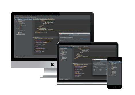
Media querys
Descripcion
Media querys para todos los dispositivos
css
/*
  ##Device = Desktops
  ##Screen = 1281px to higher resolution desktops
*/

@media (min-width: 1281px) {


}

/*
  ##Device = Laptops, Desktops
  ##Screen = B/w 1025px to 1280px
*/

@media (min-width: 1025px) and (max-width: 1280px) {

 .menuflotante{
  	top: 86px;
    position: fixed;
    background-color: #FAFAFA;
    font-family: "Open Sans",Helvetica,Arial,sans-serif;
    padding: 0px;
    color: white;
    height: 100%;
    overflow-y: auto;
    border-right: 1px solid;
    -webkit-box-shadow: 3px 0px 5px 0px rgba(184,171,184,0.69);
    -moz-box-shadow: 3px 0px 5px 0px rgba(184,171,184,0.69);
    box-shadow: 3px 0px 5px 0px rgba(184,171,184,0.69);
    z-index: 100;
  	}

}

/*
  ##Device = Tablets, Ipads (portrait)
  ##Screen = B/w 768px to 1024px
*/

@media (min-width: 768px) and (max-width: 1024px) {


}

/*
  ##Device = Tablets, Ipads (landscape)
  ##Screen = B/w 768px to 1024px
*/

@media (min-width: 768px) and (max-width: 1024px) and (orientation: landscape) {


}

/*
  ##Device = Low Resolution Tablets, Mobiles (Landscape)
  ##Screen = B/w 481px to 767px
*/

@media (min-width: 481px) and (max-width: 767px) {


}

/*
  ##Device = Most of the Smartphones Mobiles (Portrait)
  ##Screen = B/w 320px to 479px
*/

@media (min-width: 320px) and (max-width: 480px) {

   /* body{
  	background: blue ;
   }*/


}